
Principality Website
A full website re-platforming project, with mobile-first design which improves bounce & conversion rates.
Responsibilities
End-to-end design, workshop facilitation, dev handover, usability and accessibility testing
Role
UX/UI Designer
Year
2022-2024
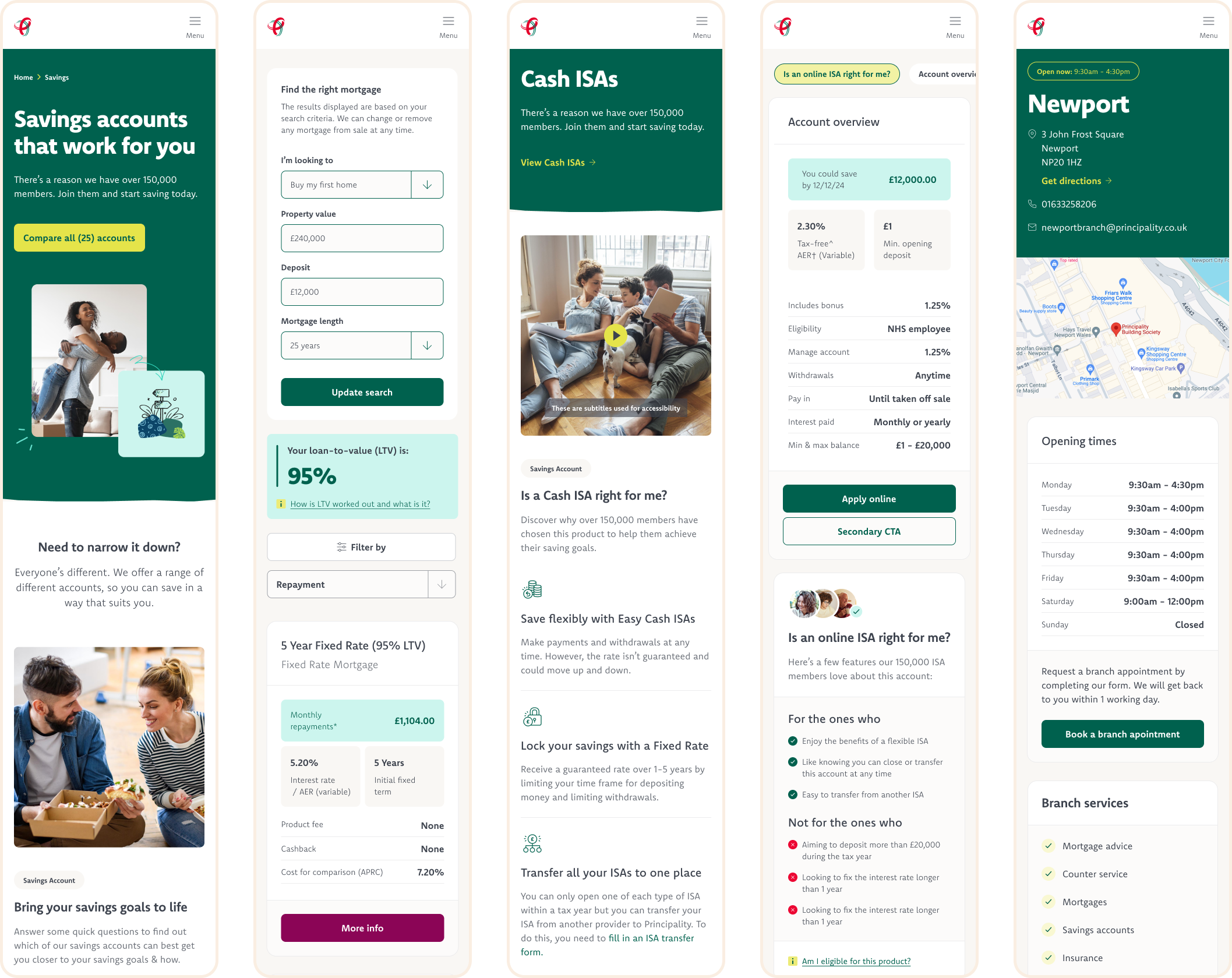
Measurable outcomes
Streamlining core journeys
76% reduction in pages
From 1,500 pages down to 350, with clearly structured journeys and a 61 component design system
More members getting to products
18.6% conversion increase
Increase in the number of users getting from savings product pages to starting an application
Better mobile experience
9.3% bounce-rate decrease
Decrease in mobile users immediately abandoning the site and key pages
The problem
The Principality website had grown cumbersome for colleagues and users alike. The site had grown to over 1,500 disjointed pages which were inconsistent, hard to navigate, and hard to maintain.
The core conversion journeys to find & apply for savings and mortgage products are responsible for up to 80% of site traffic, but were poorly optimised for mobile and modern browsing behaviours.
Internal risk aversion constrained the ability to make user-led decisions and improvements over time.
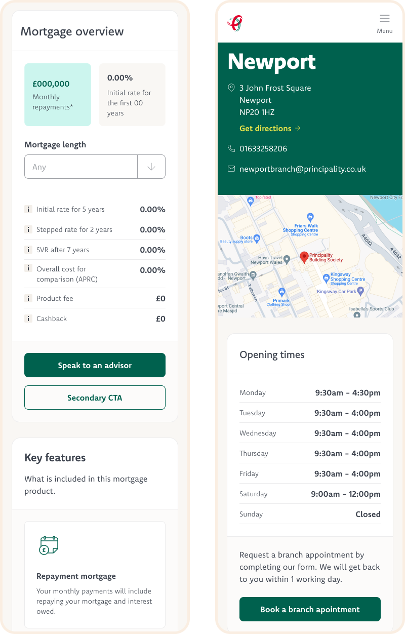
The project
Ultimately, the project was a huge 2 year undertaking, encompassing:
End-to-end design for core acquisition journeys
Creating and maintaining a large design system, with over 60 reusable components and detailed documentation for development
8 rounds of usability testing and specialist accessibility testing
Leveraging key insights to inform user-led decisions, whilst balancing financial regulations and business requirements
Running workshops with key stakeholders to align and foster collaborative relationships
Since launch, I have also worked on:
Working towards a WCAG 2.2 AA accreditation with the Digital Accessibility Centre (DAC)
Formulating A/B test hypotheses for conversion rate optimisation
Exploratory user testing to validate ‘big bet’ ideas
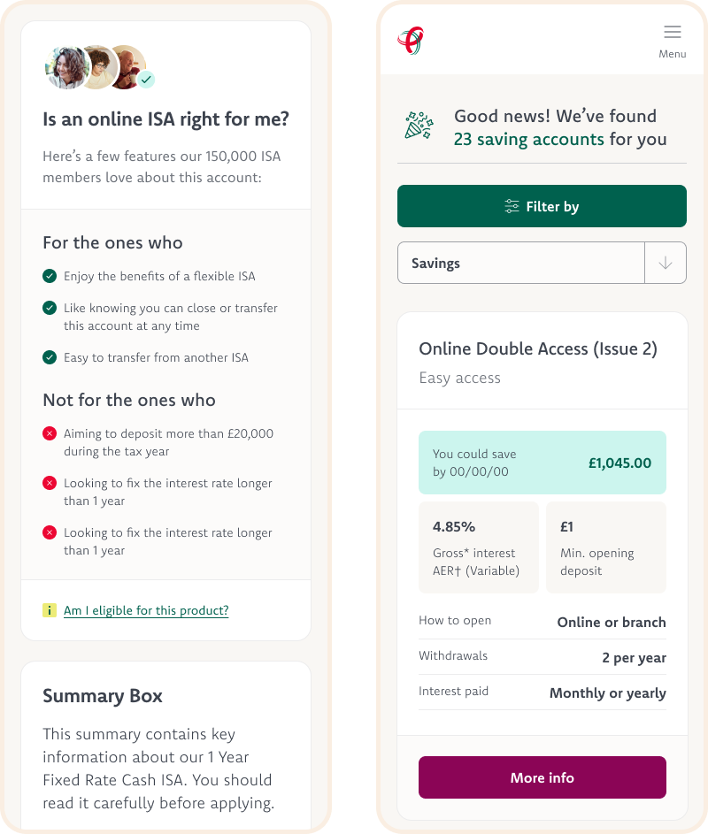
Understanding the journey
As a new member of the team at the time, I led workshops with internal stakeholders to understand the user journey. Including friction points, ‘must have’ regulatory requirements, and business requirements. I was also brought up to speed on existing usability testing and benchmarking to help inform my design ideation & development.
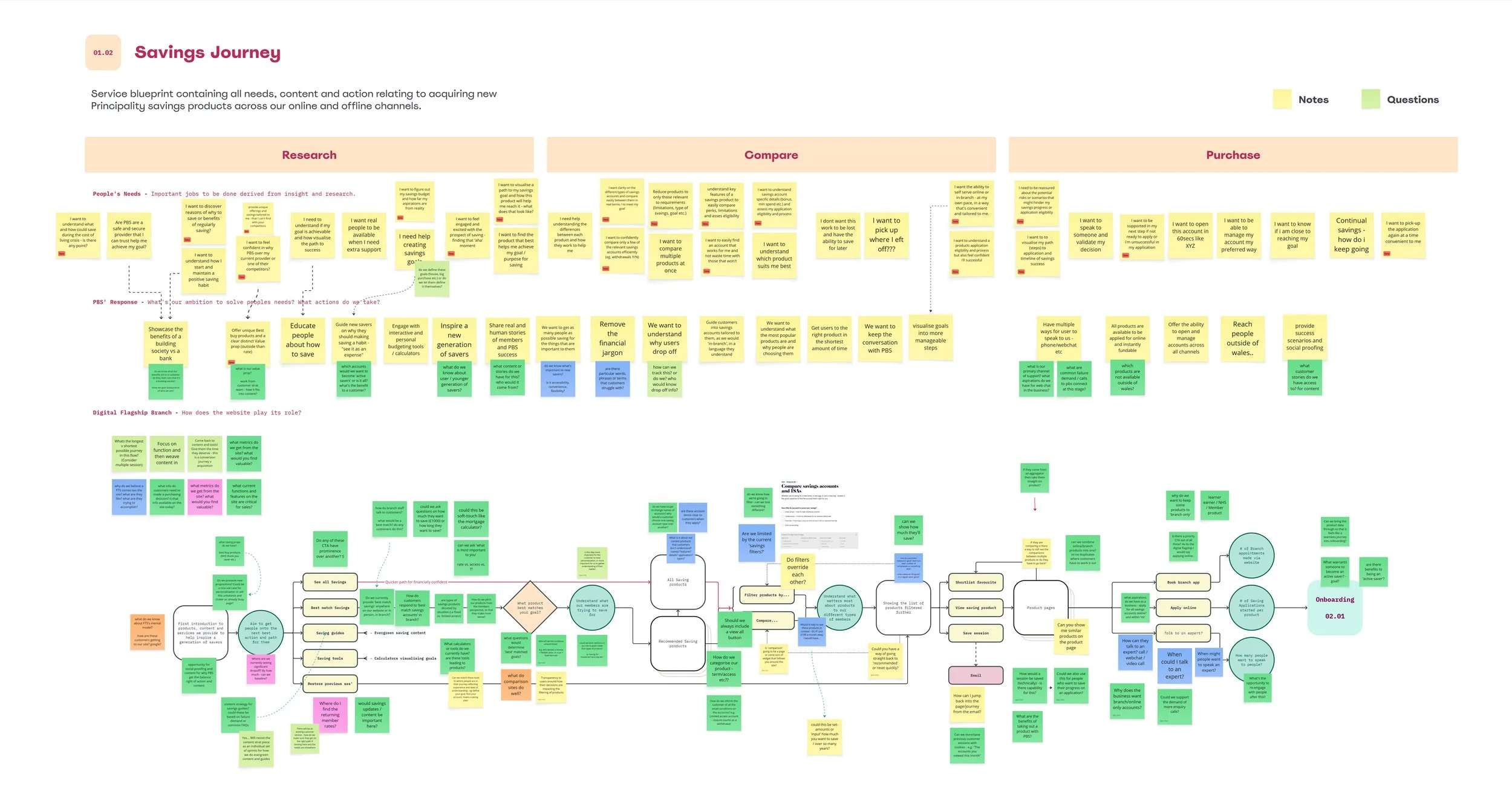
Customer journey map with stakeholders
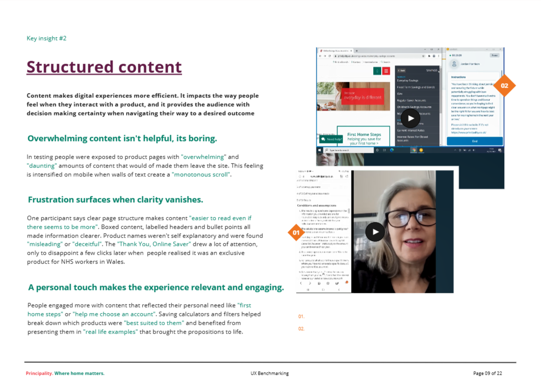
Research report prior to 2024
Exploring the solution
Using design workshops within the UX team, we conceptualised potential solutions to the problem areas identified. We used design sprint methodologies to engage collaborative and sign-off stakeholders at the early stage of the design process.
Some early concepts were sent to explorative user testing as prototypes, to validate and discard ideas quickly.
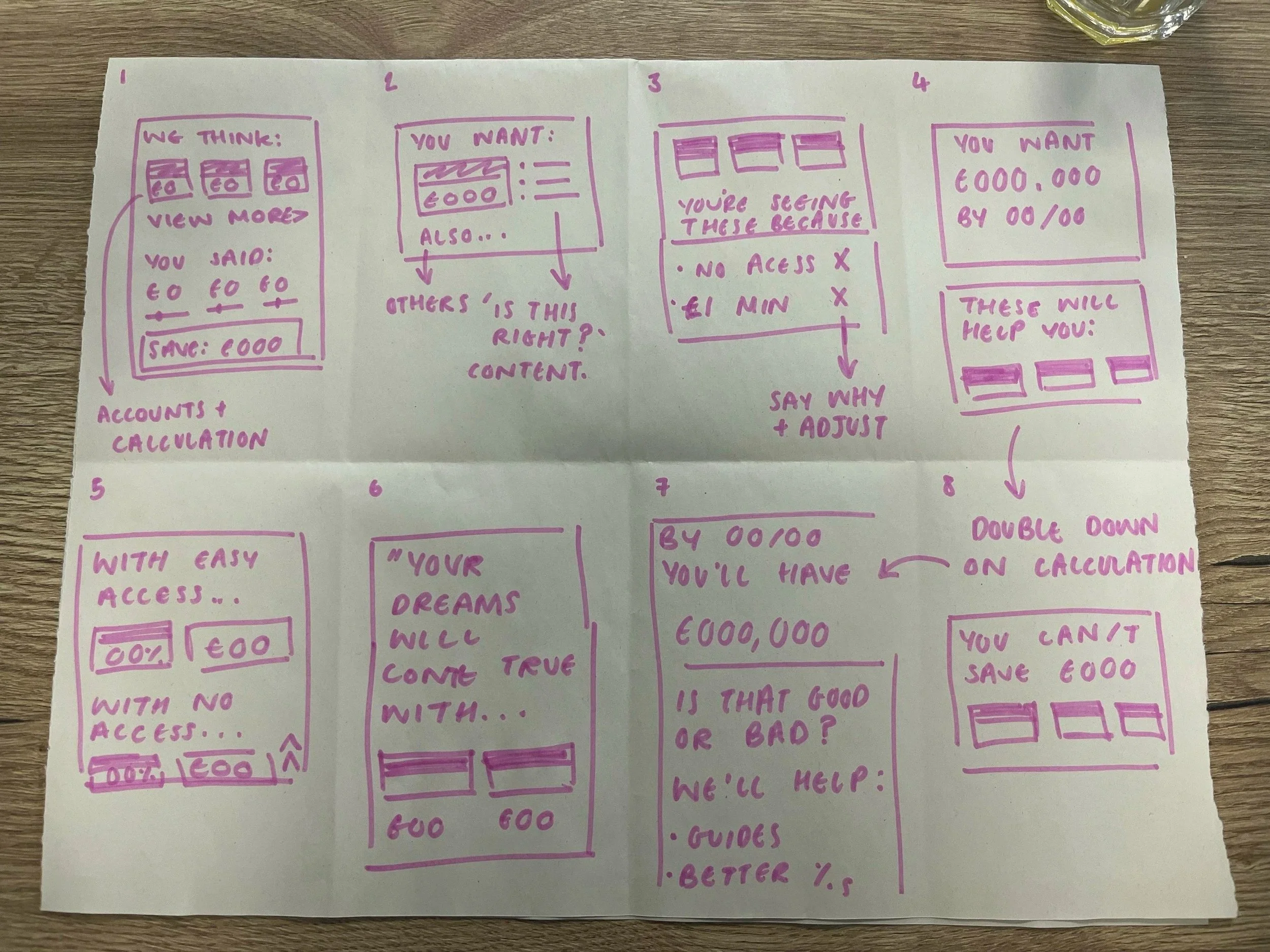
“Crazy 8” workshop sketches with stakeholders
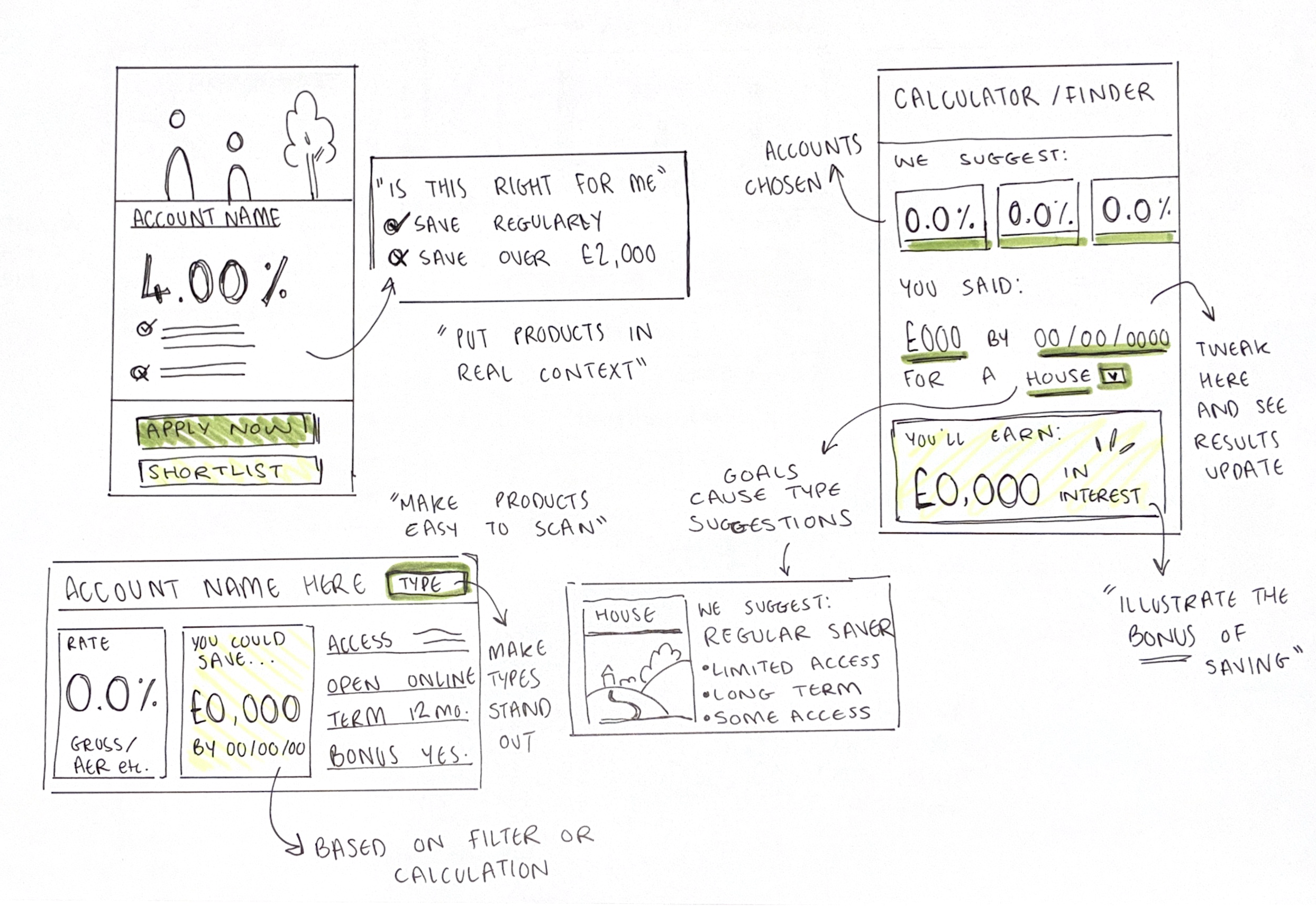
Higher fidelity ideation sketching for concept testing

Some of the concepts taken to explorative testing. Examples of changes include: compare tool being ruled out as a result of improved comparison in the product list. Hierarchy of ‘you could save’ calculation was promoted due to perceived value. Mortgage journey was streamlined to allow quicker routes to product detail, with most users wanting quicker access to this information.